|
|
|
“Pay off diagrams” a good way to understand
the profits and losses with a strategy
A convenient way to envision what happens with option
strategies as the value of the underlying asset changes
is with the use of a profit and loss diagram, known as a
“payoff diagram”. A Payoff diagram is a graphical representation
of the potential outcomes of a strategy. Results may be
depicted at any point in time, although the graph usually
depicts the results at expiration of the options involved
in the strategy.
|
|
| The
vertical axis of the diagram reflects profits or losses
on option expiration day resulting from particular strategy,
while the horizontal axis reflects the underlying asset
price on option expiration day. At expiration, there is
no time value left, so the option will sell for its intrinsic
value. By convention, the diagrams ignore the effect of
commissions you have to pay.
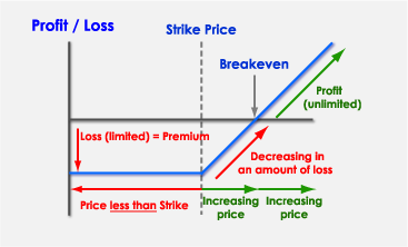
“Profit or
loss in Baht are graphed on the vertical axis
Various underlying asset prices are graphed on the horizontal
axis”
|
| |
Example
Long Call Options
|
| |
According
to the Payoff diagram of Long Call Options strategy, it
can be seen that if the underlying asset price is lower
then the strike price, the call options holders lose money
which is the equivalent of the premium value, but if the
underlying asset price is more than the strike price and
continually increasing, the holders’ loss is decreasing
until the underlying asset price reach the breakeven point,
and since then the call options holders profit from their
long call positions
|
| |
More payoff examples of
4 main strategies of options investment |
| |
|
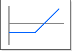
Long
Call Options |
| |
|
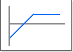
|
Short Call Options |
| |
|
|
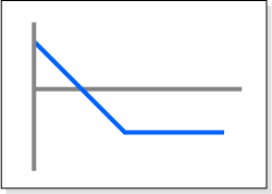
Long Put Options |
| |
|
|
Short Put Options |
|